A Visit to Paul Smith, London – Where Retail Meets Artful Expression
- Fleet Luxury

- Apr 27
- 2 min read
By Mark Lowry, CEO, Fleet Luxury Packaging
There are certain retail brands that manage to strike a rare balance between heritage and modernity, where tradition is not preserved in glass but reinterpreted with energy and personality. Paul Smith is a perfect example of this. A cornerstone of British fashion, the brand has built its reputation on classic tailoring infused with wit, colour, and unmistakable character.
I recently visited one of their London stores, and it’s fair to say the experience is as distinctive as the brand itself.
From the outside, the storefront immediately sets the tone. Unlike more conventional luxury stores, there is a sense of individuality that draws you in. The window displays are thoughtfully composed, often with unexpected twists subtle pops of colour, playful props, or clever visual storytelling that reflect the Paul Smith ethos. They feel less like traditional retail windows and more like curated moments of personality, inviting curiosity rather than simply showcasing product.

Stepping inside, that narrative deepens.
The store environment is a masterclass in controlled creativity. Clean lines and tailored layouts sit alongside bold accents, vibrant stripes, eclectic artwork, and carefully placed design details that bring warmth and humour into the space. It is a retail setting that feels both premium and approachable, polished yet never intimidating.
Navigation is effortless, with each section clearly defined while still maintaining a sense of discovery. From tailoring to accessories, the collections are presented with precision, but always with a lightness of touch that keeps the experience engaging.


One moment in particular stood out during my visit, a space anchored by a large, multi-panel artwork that immediately draws the eye. Bold, abstract, and full of movement, it brings together a spectrum of colour and organic forms that feel almost alive within the room.
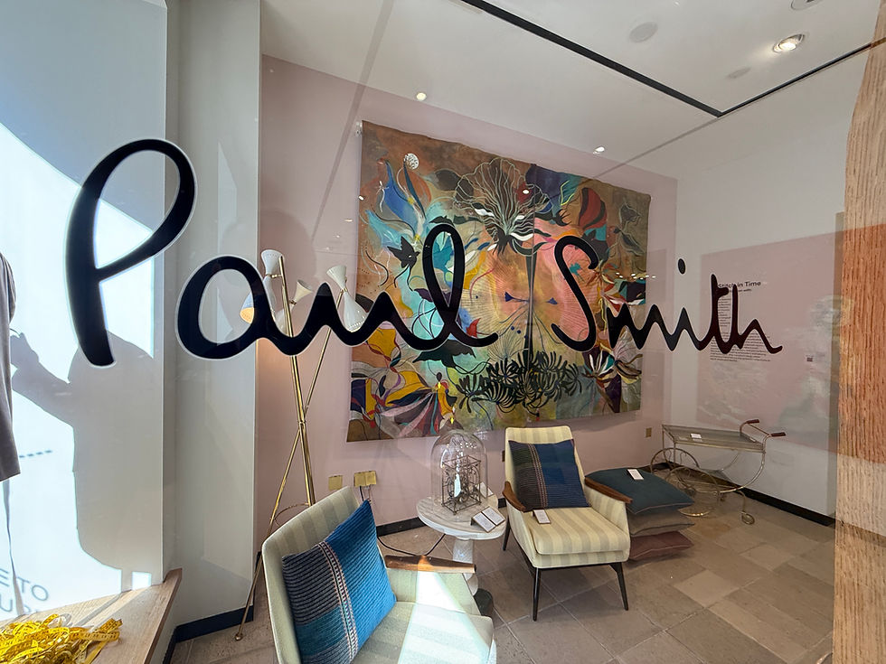
What makes it especially effective is the balance. Set against a soft pastel backdrop, the intensity of the piece is softened, allowing it to energise the space without overwhelming it. Surrounding furniture, mid-century inspired seating, layered textiles, and carefully chosen decorative objects, creates a setting that feels more like a curated living environment than a traditional retail floor.

It’s a perfect example of how the brand uses interiors not just as a backdrop, but as an extension of its identity. The space feels considered, expressive, and quietly confident, never overworked, yet rich in detail.
What stands out most is the brand’s ability to remain consistent while embracing individuality. Every touchpoint reflects a clear identity rooted in craftsmanship and quality yet elevated by a sense of play. This is not retail that takes itself too seriously, but it is retail executed at an exceptionally high level.

From a packaging perspective, it’s particularly rewarding to observe how presentation supports that identity. Packaging here is not just functional; it becomes an extension of the brand’s personality. Clean, refined, but often punctuated with signature colour detailing that makes it instantly recognisable.
At Fleet Luxury, we understand how critical these subtle elements are in shaping the overall customer experience. Seeing how brands like Paul Smith integrate packaging into their wider retail narrative is always both insightful and inspiring.


Comments